Reading the Web Traffic Graphs
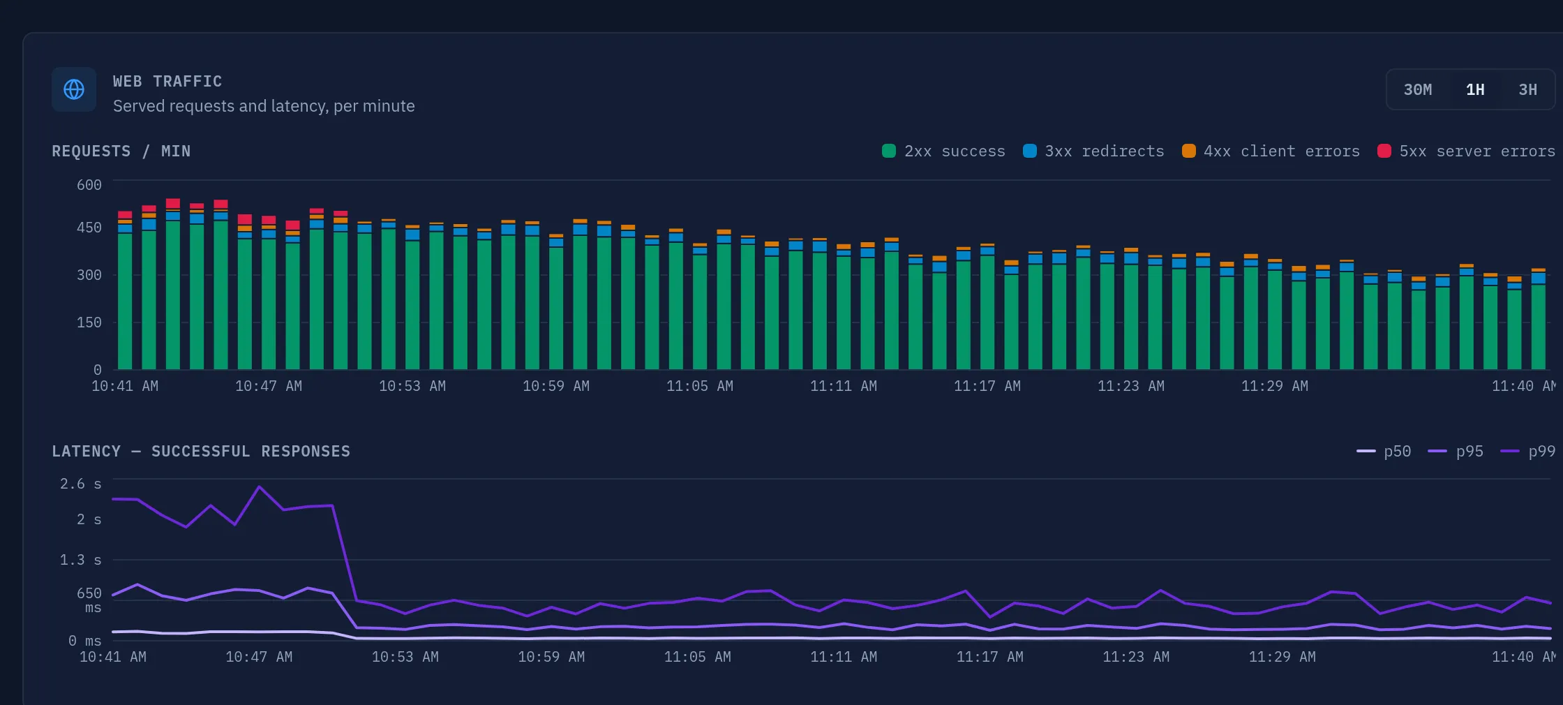
The Web Traffic panel on the CorePanel dashboard shows what your web server is doing, minute by minute, over the last 3 hours. The data is measured inside the web server itself (CoreHttpd) as it serves every request — it is not an estimate, a log sample, or an external probe.
A few basics before diving in:
- Every bar and every point is one minute of traffic.
- The 30M / 1H / 3H toggle changes the visible window; the server always keeps the full 180 minutes.
- The panel refreshes automatically every minute. Times are shown in your browser’s time zone.
- Hover any minute to get exact values for every series.
Requests per minute
Section titled “Requests per minute”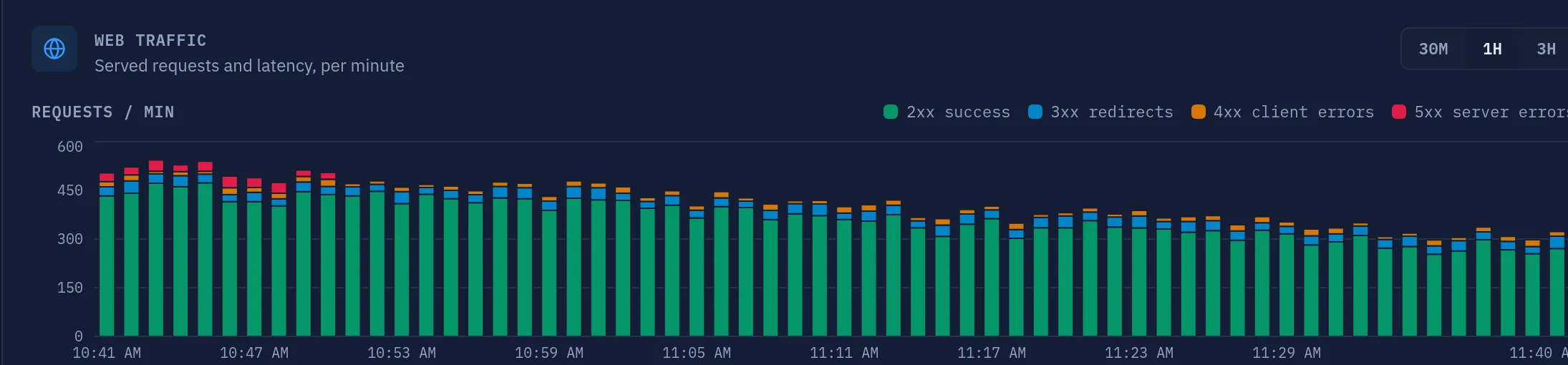
The top chart counts every request the server finished in each minute — all methods, all outcomes. The height of a bar is your traffic volume; the colors split it by HTTP response class:
| Color | Class | What it means |
|---|---|---|
| Green | 2xx success | The request was served correctly. This should dominate every bar. |
| Blue | 3xx redirects | The server answered with a redirect (e.g. http → https, moved pages) or a 304 Not Modified cache revalidation. A steady share is normal. |
| Amber | 4xx client errors | The client asked for something the server can’t serve: missing pages (404), forbidden paths (403), bad requests. |
| Red | 5xx server errors | The server (usually a site’s application code) failed to produce a response. This is the color to watch. |
What to look for
Section titled “What to look for”- Mostly green with thin blue/amber caps — healthy. Every real site gets a trickle of 404s and redirects.
- A red band appears — some site is throwing errors (crashing PHP, a broken plugin or theme update, an unreachable database). Check the affected site’s error output around that time; the latency chart below usually tells the same story.
- An amber flood — a burst of 404/403 is almost always bots and vulnerability
scanners probing paths like
/wp-adminor/.env, or a deployed site with broken internal links. Scanners are background noise on any public server; a sustained wall of amber is worth a look at the access logs. - Rising blue — often harmless (cache revalidations from returning visitors), but a sudden jump can indicate a redirect loop on a site.
- A sudden cliff or spike in total height — traffic itself changed: a campaign, a viral link, or a bot wave. Height alone isn’t a problem; check whether latency held steady while it happened.
Latency — successful responses
Section titled “Latency — successful responses”
The bottom chart answers a different question: how fast were pages served? It shows three latency percentiles for each minute, in milliseconds:
- p50 (median) — half of all responses were faster than this. This is the typical visitor experience.
- p95 — 95% of responses were faster than this. This is your slow tail: the experience of the unluckiest 1-in-20 requests.
- p99 — 99% were faster. Your worst case, short of outliers.
A useful mental model: p50 is what most visitors feel, p95/p99 is what your slowest pages and heaviest queries feel. A large gap between p50 and p99 is normal on a hosting server — cached static files are served in under a millisecond while a heavy WordPress page might take a second.
What to look for
Section titled “What to look for”- Flat, low p50 with a wobbly p95/p99 — normal. The tail reacts to individual heavy pages, cron-like requests, and cold caches.
- p95/p99 climbing while p50 stays flat — a specific part of a site got slow: one heavy page, a slow database query, an external API call timing out. Most visitors are still fine.
- All three lines rising together — the whole server is straining: CPU/memory saturation, PHP workers exhausted, or a database under pressure. Cross-check the Disk/Load/Memory cards at the top of the dashboard.
- A step change after a deploy or plugin update — compare the shape before and after the change; this chart is the fastest regression detector you have.
- A spike in p99 that coincides with a red (5xx) band above — the application was failing and slow; start with the site’s error logs.
Gaps and missing values
Section titled “Gaps and missing values”- A gap in both charts (no bars, no lines) means the web server was not running during those minutes — after a restart the history up to the stop is preserved, so the gap marks the downtime itself. This is the only thing that breaks the latency lines.
- The latency line spanning a minute with no sample is normal: a minute can carry traffic yet qualify nothing for sampling (only POSTs, only redirects) — or simply be quiet. Nothing was measured there, so the line joins the two neighbouring measurements instead of breaking, and the tooltip shows ”—” for that minute’s percentiles.
- Dots on the lines mark the minutes that were actually measured. They appear whenever the samples are sparse — the usual case on a low-traffic server — precisely so the measurements are distinguishable from the stretches the line merely spans. Read a peak with a dot on it as one slow minute, not as a slow period; without the dots, a single slow minute between two distant measurements would look like a long climb and a long recovery. On a busy server nearly every minute is measured, the dots would only add noise, and the chart drops them.
- A lone dot with no line means a single minute was measured between two downtime gaps — there is no second point to draw a segment to.
One site at a time
Section titled “One site at a time”This panel is the whole machine, and there is no per-site version of it: the counters live inside the web server and are kept server-wide.
For one domain, read its access log — every request it served, with the
status code that was answered. It is per hostname, so example.com and
www.example.com are two separate logs. Server → Logs reads it by name
(site-access, then the hostname); filtering for " 500 " turns it into
exactly the list of failing requests, and it costs the web server nothing — the
file is already being written. See Reading logs, and
MCP for the same read from an assistant.